Food For Everyone
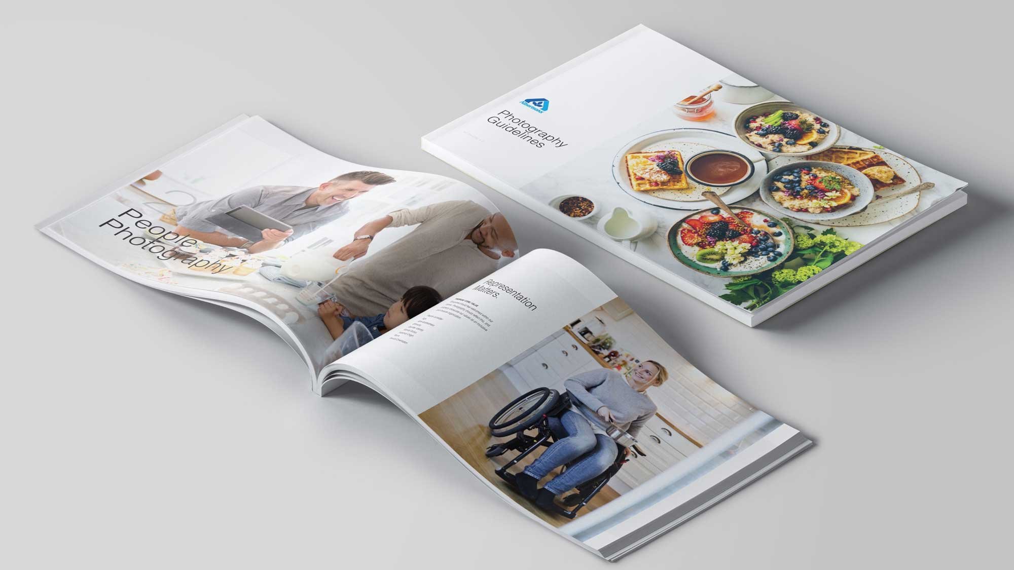
The company's vigorous acquisition strategy and subsequent business expansion had resulted in a decentralized and bewildering array of brands at various stages of neglect, posing numerous challenges. Chief among these was the lack of uniformity across design assets, making it arduous to maintain a coherent brand identity. Additionally, the absence of a definitive source of truth or guidelines compounded the issue. Communication between design and development teams had proven cumbersome due to siloed structures, resulting in inconsistent implementation of shared components. To address this, I led a team effort to devise comprehensive brand guidelines and a digital design system toolkit encompassing the entire brand portfolio.
Unified Design System for Dozens of Brands
The diverse digital assets of the two dozen brands posed considerable hurdles. To tackle this, I led the development of pillars to unite akin brands, each preserving its distinctive voice, visual flair, and photography. This entailed envisioning groupings for the brands and crafting a harmonious identity for each pillar. The outcome was a more seamless and unified digital presence for Albertsons, facilitating consistent design asset implementation and enhanced team communication.

Chaos into Order Through Guidance
Bringing the array of brands together under unified pillars and offering simultaneous guidance was a pivotal move in revamping the Albertsons portfolio. This consolidation empowered Albertsons to be more agile in its brand representation and efficiently leverage assets across multiple brands. Consequently, the company became better equipped to respond to evolving consumer preferences and market dynamics, all while upholding a coherent brand identity. The provided guidance also ensured alignment of all Albertsons brands with the company's overarching vision and mission.
Brand Guidelines Digital Toolkit
Uniting the diverse range of brands under cohesive pillars and providing simultaneous guidance marked a significant stride in revitalizing the Albertsons portfolio. This consolidation enabled Albertsons to exhibit greater flexibility in brand representation and optimize asset utilization across multiple brands. Consequently, the company enhanced its ability to adapt to shifting consumer tastes and market trends while maintaining a consistent brand image. The guidance also ensured that all Albertsons brands remained aligned with the company's overarching vision and mission.
Polaris Design System
Our initial foray into the expansive realm of brand guidelines begins with the design system, showcased here in Sketch. Crafted collaboratively by the team and myself during the design phase, we continuously updated it with each new site release. Designed to seamlessly adapt to any brand, it effortlessly transitions between five color themes and various pillar representations. This versatility ensures that each site, while built on a unified AEM backup system, retains its individuality when needed.
Responsive E-Commerce
The collaborative effort behind the new design system, which I played a key role in developing alongside a dedicated team, enabled customization across all 20+ Albertsons banners. After demonstrating the system's benefits to the client—such as facilitating consecutive banner launches and guiding new contributors and their internal design team—they swiftly embraced the approach. The homepage's modular structure was designed to accommodate the representation of the brand, merchants, and CPGs seamlessly on the site.
Impact
Established new consistent communication guidelines and implemented a new visual design system for all interactive experiences. A new website was built to provide a centralized location for all digital assets and guidelines in one place, including the PDF guideline documents. To achieve this, front-end components were developed using AngularJS, including digital components like atoms, molecules, and organisms. The library of digital components was then integrated into the CMS website, making it easy for the Albertsons organization to access the most up-to-date assets. To ensure a smooth transition, training sessions were conducted for the Albertsons UX/Design, Tech, and Brand Teams. Finally, the CMS website was handed off to the team, giving them complete control over their digital assets and guidelines.
One source of guidance for content and assets for all third party, external and internal creative and development teams that streamlined communication efforts worldwide.
Conversion Rate
+13%
Checkout Completion Rate
+18%
Mobile Web Revenue
+51%
Interactions with Deals Carousel


